What StoryBrand Gets Wrong About Online Marketing
admin | Sep 1, 2020
In this article, we’ll explain what advice to avoid in Building a StoryBrand when it comes to your digital marketing.
What is StoryBrand?
At its core, StoryBrand is a framework to position a company for marketing success. Donald Miller, the founder of StoryBrand and author of the book, succinctly gives the purpose and mission of StoryBrand in the book’s introduction:
“Each year we help more than three thousand businesses stop wasting money on marketing and get their company growing” (page ix).
Through this book, online and in-person training, and a growing team of certified consultants, StoryBrand is having an impact on how companies tell their story and position themselves to potential customers.
What StoryBrand Gets Right
Before we look at our critiques, we do want to say that there is great value within Building a StoryBrand. Any business owner or marketing manager would do well in reading the book as they embark on creating a positioning or messaging strategy.
Here are some of what we like about StoryBrand:
Focus on the Customer
We have seen far too many websites that focus inwardly on the company and not on the customer experience. We always have to remind our clients that they are not the customer and that your website needs to communicate to their needs and what they are looking for.
StoryBrand’s language of making the customer the hero of the journey is a great angle on this customer-first mentality. All of your company’s marketing should reflect empathy, understanding, and awareness of your customer’s stated and unstated problems.
Focus on Your Value Proposition
Throughout his book, Miller emphasizes the importance of clarifying what you do for your customers. We agree that one of the most valuable things a company can do is get as specific as possible in how you help your customers better than everyone else.
Too often a client comes to us and says “we offer better customer service” or “we care more than our competition” – but none of these are truly unique.
What can you say that your competition cannot say? What can you say that will break through the noise and give your potential customers a compelling reason to hire you?
Our Struggles With StoryBrand
While reading Building a StoryBrand, we found some recommendations that we disagree with – specifically with digital marketing. Most of our disagreements came in Chapter 12 “Building a Better Website.”
Put Your Offer Above the Fold
As he starts his chapter on websites, Miller focuses a lot of time on getting a clear, concise message at the top of your homepage. In Miller’s words:
“The idea here is that customers need to know what’s in it for them right when they read the text. The text should be bold and the statement should be short. It should be easy to read and not buried under buttons and clutter.” (page 149).
According to Miller, you will lose traffic if you don’t have a clear message at the top of the fold before you scroll down the page. This focus on above the fold content is similar to the 5-second rule; no, not the one about dropping food – the 5-second rule in marketing is that you have 5 seconds to grab someone’s attention or else you’ll lose them.
This rule was formed in the heyday of direct mail marketing when someone was flipping through their mail and would decide in 5 seconds whether to keep reading your material or throw it in the trash. However, this rule doesn’t work anymore in the digital realm.
No one is ever going to your website without a prior touchpoint. Whether they clicked on an ad on Facebook, did a search on Google, clicked on a social post, or seen your billboard or offline advertisement, people are not visiting your website in a vacuum.
Your website is not to make a first impression; that’s what the ad, billboard, social post, or Google My Business listing is for. Rather, your website is to reaffirm that first impression, reinforce your message, and get people to take that next meaningful step.
Competing Calls to Action
In a section called “Obvious Calls to Action,” Miller writes that you should draw attention to a button where someone can take a meaningful next step – like Buy Now or Call Us. However, in just a few sentences, he muddies this message by calling for a transitional call to action, a competing CTA button that’s placed directly next to or below the main CTA.
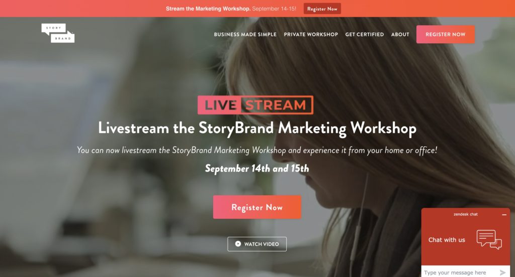
The StoryBrand homepage with competing calls to action.
While we agree that a Call to Action is a crucial component to any website, our experience and testing have shown that it should be a singular CTA, not competing ones. Even if they are different colors and offer different propositions, conflicting CTA buttons provide a mixed message to the user and result in fewer clicks than a standalone CTA button.
Too Much Focus on Smiling People
In his section called “Images of Success,” Miller rightly highlights the importance of a website’s imagery in communicating with potential customers. Yet much of his advice is to find “images of people smiling or looking satisfied” (152).
While we do find images of people can be helpful in certain industries, they are not as effective in selling for every type of business. Lawn care companies should focus on before and after photos to show the effectiveness of their treatments. Home remodeling companies need big beautiful images of their finished projects. Software companies need plenty of screenshots and videos of how their application looks and works.

A lawn car company showing off its impressive results.
We think that Miller is trying to communicate the need for photos that will communicate emotion and inspire confidence in your company. Photos of your building won’t do that, so find photos that will.
Limiting Words
Another struggle we have with Miller’s advice is how many words to have on a website. According to Miller,
“People don’t read websites anymore; they scan them. If there is a paragraph above the fold on your website, it’s being passed over, I promise…The rule is this: the fewer words you use, the more likely it is that people will read them.” (154-155).
Like some of our other critiques, we agree with the premise but disagree with the details. Websites should not be pages of single-space paragraphs, nor read like college papers or textbooks. Pages should be structured with easy to scan headlines and content that’s chunked into easy to read paragraphs.
Yet we also know that there is no one type of person who is visiting your site. Yes, some people only scan websites, but there are plenty of people who read every single word of every single page of your website.
We rely on heat mapping software that can anonymously track how people are interacting with a site. And we are blown away by how many people will click through and read every page – sometimes multiple times – before they contact a business.
This trend is especially pronounced in industries with a long sales cycle (like B2B), high-ticket purchases (home remodel projects), or industries that impact your finances or health (like financial advisors or health treatments). A buyer’s journey is going to be completely different between purchasing a $100 kitchen faucet and a $100,000 kitchen remodel, and the content should fit the audience.
Of course, your website’s audience is not only your potential customers but Google. If you don’t have enough content on your website, Google will not be able to recommend your website for relevant searches. Sure, a plumber could just have a website that says “I Fix Pipes,” but they will need quite a bit more content about their services, service area, emergency services, reviews, and brands before they are going to outrank any of their local competition.
When a Checklist Misses Glaring Gaps
Our biggest struggle with Building a StoryBrand is how some businesses may view it as the end-all to their marketing issues, rather than a helpful tool in their toolbox. If you only rely on StoryBrand (or their certified coaches) for your digital marketing support, you may discover glaring gaps in your digital marketing efforts.
We recently worked with a college that had rebuilt their website in line with StoryBrand principles. And while it checked much of the boxes for the StoryBrand framework, they made some significant mistakes in how they structured their website.
For example, while they made sure to have the primary and transitional CTA on their website, they did not include a link on their homepage to crucial pages about degrees they offered, financial aid, or important next steps like visiting the campus.
We also noticed that the site was slim on content, an intentional decision they made because “people don’t read websites.” However, within the content they removed from the site was any mention of where the college was located. I actually had to Google it to find out where they were!
Dated Advice in a Fast-Changing World
One of the inherent challenges with publishing a book is that the information can quickly get outdated – especially in the fast-changing digital marketing space. I’ve read far too many marketing books that mention MySpace, Blogger, and Google+.
Published in 2017, Building A StoryBrand doesn’t take into account the rise of responsive web design, the growth of display ads, and how important a Google Business profile has become to local businesses. You need to make sure your website design and updates are following current best practices, not ones that were published a few years ago.
StoryBrand – A Great Start for Clarifying Your Message
We think the StoryBrand framework is great for companies who need to clarify their messaging, work on their positioning, and refine their target audience. Once completed, that work can go a long way in improving all aspects of your marketing and advertising – including website, online advertising, and all print & digital collateral.
If you are looking for more resources on user experience for the web, we recommend the Nielsen Norman Group – a world leader in user experience research. Their article – First Impressions Matter: How Designers Can Support Humans’ Automatic Cognitive Processing – has valuable insights on how to make a good first impression on your website without causing confusion or conflicting messages.