Can a Professionally Built EDU Website Actually Hurt Enrollment?
Mike McGovern | Apr 1, 2022
According to reports by the Nielsen Norman Group – the world’s leading authority in web-usability research – there are many features common to higher-ed websites that users strongly dislike. Conversion scientists say these features lower the chances that a website visitor will take a positive action, like starting an application or scheduling a campus visit.
Here are some common website features users dislike the most that you might consider removing or adjusting. In this post, we’ll review the top five.
Most Disliked Website Features
Ratings on a scale of 1-7 (1 = Strong like, 7 = Strong Dislike)
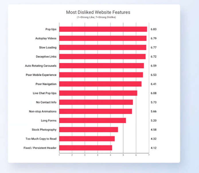
Pop Ups
Users list annoying pop-ups as their most disliked website “feature.” Mobile users dislike them even more.
Pop-ups Everywhere
Companies with easy-to-implement pop-up tools have not only promoted their use, but also made them a quick and affordable feature to implement. Don’t let the occasional positive response to your pop-up misguide you. Consider the many visitors who were annoyed by your “Apply Now” overlay, or even a poorly-timed, poorly-placed chat bot.
A Guiding Principle
Compare using a pop up to interrupting them in a real-life conversation. Normally you wouldn’t interrupt someone unless you believe it is for the other’s benefit. You would do it as politely as possible. The same applies to pop-ups. Be helpful and polite, not obtrusive.
Some Practical Advice
On your website, use pop-ups strategically and with sensitivity so they are a help to users, not an annoyance.
Consider the user’s journey through your website. A student prospect probably isn’t ready to chat with an admissions counselor immediately after landing on your homepage. However, a conveniently placed chat bot could help that same student when filling out your online application or investigating your majors page.
Regardless, consider setting it up so that the user controls when the chat window opens and closes. Remember to double-check your pop-up features on a mobile device to ensure a smooth and helpful experience across all device types.
Auto-Play Videos
Modern web users prefer to have control of their experience on your website. When a video auto plays (especially if it has sound), you take their control away and create a distracting and potentially annoying experience.
Videos are often used as backgrounds on a homepage. Website owners are typically proud of them, but they have the potential to cause problems. While background videos may be less annoying than an auto play video with sound, users often find them distracting. In general, motion graphics do not help the web visitor’s experience. In fact, it can interfere with it.
Motion Gets Attention
Advertisers like using motion whenever possible because it’s a great solution for grabbing the user’s attention. However, in the context of web page browsing, you already have the user’s attention. Every element on your website should help the user find what they are looking for and take a measurable and meaningful action before leaving the site. Motion typically gets in the way of that objective.
Motion Also Means Distraction
In general, conversion researchers discourage the overuse of motion graphics. Countless studies demonstrate how motion graphics keep users from following through with natural, positive exploration into a website.
If you’ve ever intended to start a task but were momentarily distracted, you know how difficult it is to remember what you were going to do just seconds earlier. This also holds true for your website visitors.
Avoid having something on a page move at the same moment your user goes to take a meaningful action like clicking through to your majors page or completing an application. This could distract your user and cost you a prospective student if they forget to follow through with that action.
A General Principle
Stick with static images or backgrounds for your website. Videos are ok if the controls are visible and the user can control when it plays. Website owners often insist on having motion on their website because they feel like it is somehow “better” or “more impressive.” Web users feel otherwise, preferring a website that is not distracting and easy to navigate.
Slow Loading
The Nielsen Norman Group conducted a study and determined that “Delays of just one second are enough to interrupt a person’s conscious thought process.” Meanwhile as part of its focus on user-experience, Google has made load speed a more important part of its ranking algorithm. Pages that load slowly may find it increasingly difficult to appear high up on Google’s search engine results page.
Do You Have A Slow Higher-ed Website?
Discovering the load time of your higher-ed website using a free online site-speed test might send you into a panic. Take comfort knowing nearly higher-ed websites tend to be quite large and are often slow. That said, there are two areas of focus for improving this metric; clean up your code, and get better website hosting.
Say Goodbye to Cheap Website Hosting
Generally, to achieve fast page loading speeds your website needs a clean code base and a quality hosting environment. While there are some bargains for cheap hosting, we recommend avoiding them. Many higher-ed sites today are built on the WordPress platform. If your website is built on WordPress, we recommend WP Engine for hosting or other high-quality options to help improve your loading speeds.
Is It Time To Invest In a Quality EDU Website?
Website developers often use templates with bloated coding and unnecessary plugins as shortcuts for building websites quickly and affordably. However, these “economical” websites come with bloated code that makes them slow. This saves a lot of time in the website build and is the “secret” to building cheap websites. In the end, you may end up paying a big price (in terms of Google not ranking you well and poor user experience) because you saved a few dollars on the website build.
Vague or Deceptive Links
No one wants to click on a link that says, “Discover Your Future,” but higher-ed websites consistently use confusing language for buttons and links. Institutions commonly use internal language that makes sense to team members and students but not to a prospective student. Your goal should be to clearly communicate where a particular link or CTA will take a user in every instance throughout your website. You may benefit from using a third-party UX expert as it can be difficult to keep an outside perspective on your institution’s communication style.

In the above example, the “Learn More” button links to a page outlining online degree programs, tuition costs, and the admission process. We would recommend changing “Learn More” to something like “Explore Online Degrees” or “See Online Degrees & Costs.”
Use Clear, Descriptive Language
Not only should your website use clear, commonly understood language for any link, it should also avoid non-descriptive phrases. The words, “learn more,” are commonly used but should be replaced with a more helpful description whenever possible. Here’s a great report that may convince you to have fewer “Learn More” buttons on your higher-ed website.
Auto-Rotating Carousels
Auto-rotating carousels violate several user-experience guidelines. As discussed earlier, unexpected motion is distracting and tends to lower conversion rates because it interrupts the user’s experience. The user comes to your website, starts reading the slide, and then it changes! So, they must decide “Do I want to go back and keep reading or should I read this new slide?” This is a split-second thought process, but it slows the user down and gets them off track. Not an ideal experience because as we mentioned earlier, users want control of what they see next.
Ditch The Slider?
Higher-ed websites are inherently more complicated to build because there are so many departments and audiences to serve. Websites often use sliders to help solve this problem. One slide can highlight the beautiful campus and the next can announce an upcoming event. A user may be exploring your website as either a prospective student or as a potential event attendee, but most likely not both. If the slider changes on its own, your user’s experience will also change.
There’s nothing inherently wrong with a slider. If you’re going to use a slider, we recommend that you make access to the controls clear and let the user control when it changes.
A Few UX Changes Can Make a Big Difference
You may not have the budget to advertise to and reach thousands of student prospects, but you can devote some marketing resources to ensure that those who do reach your website have a positive experience.
Implementing just a few simple UX changes can improve your website’s conversion rate, the percentage of visitors that do something measurable and meaningful before leaving, like scheduling a campus visit or starting the application process.
You can expect to see better navigation patterns and improved conversion metrics by following the research and eliminating website features that users don’t like.
Next Step: Get a UX Audit for Your Website
We have a Nielsen Norman Group UX-certified Master and higher-ed content experts in-house here to help you. Let us know if you’re interested in a UX audit for your website. Our audit will reveal problem areas and solutions to improve usability on your website.